I love scrapping holidays at totally weird time of the year. Like scrapping Christmas layouts in the middle of the summer etc. In fact I very rarely tend to scrap an occasion just after it's happened. A good example is this Easter layout...
Like, why not scrap Easter in July? :) These are some photos that my parents sent me at Easter from Sweden. My dad, sister and two nieces at my parents' "summer" house. And I really loved scrapping with these bright fun Sassafras supplies :)
Those button flowers by Sassafras are quickly becoming a favourite of mine!
Friday, July 31, 2009
Wednesday, July 29, 2009
Birthday card...
No it's not my birthday today LOL! Nor anyone else's either for that matter...or at least no-one that I know. But I love making cards and having a few "in stock" as such ...that way you never have a last minute panic. Not that I'm really a last-minute-panic-type-of-person (I'm normally very organised and on time ...sometimes even a bit too much so LOL!) But it's till good to have a few cards spare.
I recently spotted a very cute birthday related kit by Melissa Bennett at Sweet Shoppe Designs and decided to go with that for one of my Creative Team assignments. There were some cute cakes and cupcakes in the kit but to make it slightly different I decided to go with a big yummy ice-cream on the card instead :)
Monday, July 27, 2009
Golf...
No I'm not golf person, but I know many who are. Including my parents. My sister and brother used to play golf too. A few years ago (well, actually we're talking quite a few as these photos were taken with my very first ever digital camera) I walked with them around the golf course and took some photos...
...and when Kate Hadfield recently released the perfect golf doodle kit I just had to hunt for those old photos again :)
[Supplies: Fresh Beginnings - Anne deJong, Par For The Course - Kate Hadfield, Template Pack 9 - Kaye Winiecki, Springtime Collaged - Anne deJong (all from The Lilypad)]
...and when Kate Hadfield recently released the perfect golf doodle kit I just had to hunt for those old photos again :)
Sunday, July 26, 2009
Paper Scrapping...
I know I keep saying it over and over again, but... I really must find some more time for paper scrapping. It is what I really love when it comes to scrapping, and what I started out with, yet it often comes last on my list due to lack of time.
Most of the time it's digital or hybrid Creative Team work assignments that demands my time and there's very little time left over for paper scrapping. But give me some pretty papers any time (like these cute ones from Sassafras) and I'm in heaven, scrapping with a big smile on my face.
PS. If anyone has found a solution to how to find more time - please let me know :)
(Sorry for the very poor photo of this, the layout does not look straight at all, which it of course is in reality!)
Most of the time it's digital or hybrid Creative Team work assignments that demands my time and there's very little time left over for paper scrapping. But give me some pretty papers any time (like these cute ones from Sassafras) and I'm in heaven, scrapping with a big smile on my face.
PS. If anyone has found a solution to how to find more time - please let me know :)
Saturday, July 25, 2009
Making "Storyboards"...
This was another lesson in the class taught by Jessica Sprague - how to make "storyboards". Even though I have heard the term before I was not totally sure what it meant ...or what it was exactly...
In fact I'm still not totally sure of the term...though I guess it makes sense in a way as a row of photos normally tells a story if they are connected. Also we were working with 3 photos for this assignment, maybe if you had a few more it would feel a bit more like a "story".
This is what I came up with. The title is a direct copy of Jessica's title and the photos we're some photos of my niece which I was sent the very same morning by mum & dad.
A pretty cute idea I think and also something that would be great to have printed and then use it on a scrapbooking page. Something I will definitely keep in mind for the future :)
Thursday, July 23, 2009
"Eating Out" Layout Class...
I designed this class as part of my on-line class work for A Trip Down Memory Lane. Please feel free to use these instructions to make your own layout. You are free to link to this page from any forum etc if you wish. Please do NOT copy this information and/or photos to use for your own classes/forums/webpages without permission.
Supplies needed:
Scenic Route – Sonoma Collection – Madera Drive
Scenic Route – Sonoma Collection – Scrap Strip 2
Scenic Route – Sonoma Collection – Sonoma Labels
Bazzill Kraft Cardstock
American Crafts – Thickers – Red, Daiquiri #42834
American Crafts – Thickers – Green, Gift Box #42762
Autumn Leaves Stampology “Journal” stamps AL3189
Kaiser Scrapbook clear rhinetones
StazOn “Blazing Red” ink pad
Also needed:
Scraps of white cardstock
Glue (I use Herma removable)
Black journaling pen (Zig Millennium)
Charcoal Chalk Inkpad (optional)
Woodware 3” scalloped round punch (optional)
Start by cutting your “Madera Drive” paper to size. We will be using the brown patterned side as the base for the layout. I scrap in true A4 size, so I cut mine to 29,7x21 centimetres (cm). Please feel free to adapt to another layout size if you prefer.
Pick your photo. I have a 15x10 cm landscape photo which I have printed in black & white and cut into three strips. (Make sure when you plan your cuts that you don’t cut through someone’s face.)
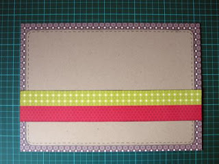
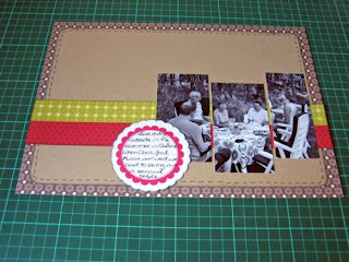
Cut your Kraft cardstock so it’s 1 cm smaller on each edge than your main background (in my case: 19x27,7cm). Round the corners, chalk the edges and create “fake stitching” around the edge using a black pen. Cut the red and green strip from the “Scrap Strips 2” sheet.
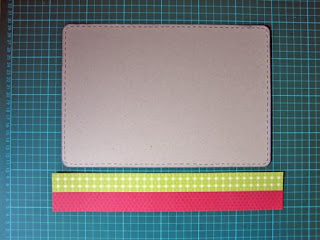
Glue the Kraft cardstock in the middle of your layout. Add the red & green strip (chalk edges if you wish) starting 5 cm from the bottom of the layout.
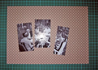
Add your photos, at different heights, to the right of the layout trying to keep the spacing between them even. Then stamp the round scalloped journaling stamp, in red ink, onto some scrap white cardstock. Cut around or use scalloped punch. Journal and attach to the layout using the photo below as a guideline.
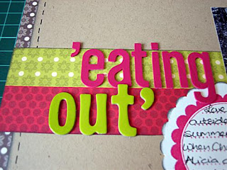
Make up your title using a mix of American Crafts Thickers stickers.
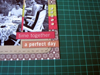
Cut out some word strips from the “Scrap Strips 2” paper and put these in the bottom right corner. Add some jewels to the edge of the red & green strip.
Finish by picking a sticker from the Sonoma sheet, add your date on it and place near the top left of your layout.
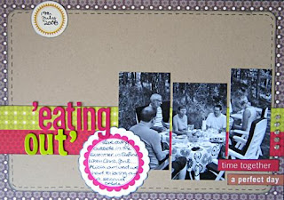
I hope you enjoyed my class! Wishing you lots of fun creating your own version!
Wednesday, July 22, 2009
Reading...
I love reading! Totally love it and always have done ever since I was old enough to read. And I love cute little bookmarks...
As soon as I saw this kit by Mindy Terasawa I knew it would make a great summery bookmark:
I'm planning on re-reading both the Twilight and the Harry Potter series in the autumn. Well...I probably won't even wait that long actually. I have a few books in line first, but let's say August instead. I have read the Harry Potter series a few times now (in 2 languages) but I'm still itching to read it again...especially after seeing the latest film in the cinema at the weekend.
Monday, July 20, 2009
Harry Potter & The Half-Blood Prince...
So have you seen it yet...?
We went to the cinema yesterday afternoon and watched the new Harry Potter film - "Harry Potter and the Half-Blood Prince". The cinema was super busy and several shows had sold out. We'd originally planned to go to a different cinema but the showing we wanted was completely sold out.
As usual, with a Harry Potter film, I did wonder how much sense the film would actually have made for someone who'd not read the book (not that much I don't think). But then again, I guess most people have indeed read the books, or definitely if you bother going to watch the film I guess :) A great film and I'm so pleased we managed to find some time to go and watch it over the weekend. I'm already eagerly awaiting the DVD release...whenever that might be :)
Also I was really pleased with the movie trailers before the film as we got some really great news! "New Moon", the second film in the Twilight saga, has it's UK movie premiere on my birthday - I know what we'll be doing on November the 20th :)
We went to the cinema yesterday afternoon and watched the new Harry Potter film - "Harry Potter and the Half-Blood Prince". The cinema was super busy and several shows had sold out. We'd originally planned to go to a different cinema but the showing we wanted was completely sold out.
As usual, with a Harry Potter film, I did wonder how much sense the film would actually have made for someone who'd not read the book (not that much I don't think). But then again, I guess most people have indeed read the books, or definitely if you bother going to watch the film I guess :) A great film and I'm so pleased we managed to find some time to go and watch it over the weekend. I'm already eagerly awaiting the DVD release...whenever that might be :)
Also I was really pleased with the movie trailers before the film as we got some really great news! "New Moon", the second film in the Twilight saga, has it's UK movie premiere on my birthday - I know what we'll be doing on November the 20th :)
Sunday, July 19, 2009
Selective Re-Colouring...
Right, back to the Jessica Sprague photo editing class and the next lesson. This lesson I really love as the result is so "wow". Yes it's not something you want to do to every photo, or even that many, but on the odd one it can really give a dramatic effect. We're talking about selective re-colouring...
You start off with just a normal photo. Preferably something with a bit of a "big focal point". Something like a landscape photo without a main focal point won't really get the same effect at all...
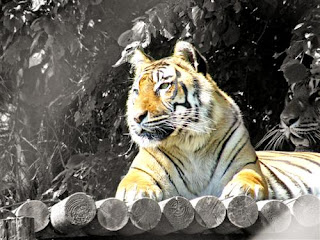
Then you remove all the colour from the photo and using a layering mask you "paint in/back" the colour on the selected part(s) that you want to have coloured. It's really, really cool. I have done this a few times in the past but not enough to remember how to do it off hand. So again it's a case of being reminded on how to do it before the technique comes back to you. Anyone get a feeling I have said this a few times during the class and maybe, just maybe, I should take some time to practice all these techniques a few times so I don't need to look up how to do it next time? I do!! LOL! It's just finding the time for it...
Saturday, July 18, 2009
Some Digital Scrapping...
Thought I would take a day's break from posting my photos from the class and instead put up a digital page which I made on Thursday. It's made as part of my Creative Team work for the Lilypad and I used some really cute and happy coloured kits that were released yesterday:
[Supplies: Scrap Pad Polly Love 2 - Amy Martin, Fun Land - Jaqcue Larsen, Dani Mogstad, Scruffy & Stripey Alphabet - Kate Hadfield, Spring Greens - Kate Hadfield, Cottage Garden - Kaye Winiecki (all from the Lilypad), Border Basics Squares -Libby Weifenbach (from SSD)]
Right I'm off out.Going hunting for some birthday presents both for my niece and my mum. And after that we hope to have a walk around an outlet centre too. We'll see how far we get :)
Friday, July 17, 2009
Start-To-Finish Project...
It is such a dark and rainy day here today. Totally miserable weather really, so I'm trying to keep a smile on my face still. Seriously it's just gone past 10 in the morning and it's so dark from the sky and the rain that you'd have to turn the light on if you were to read a book. In JULY! LOL! Madness...
Anyway, let's keep that smile and talk about some fun things. The next lesson for the photo editing class that I'm taking. It's called the "Start-To-Finish project" lesson. And it really was a start-to-finish thing in the way that we incorporated lots of the techniques, into one project, that we'd already learnt during the class. Very much fun :)
For the lesson, I picked this photo. It's just a totally unedited, straight-out-of-the-camera type photo:
And we then did lots of cool things to it. Going through the things that we'd learnt. Using clipping masks, textures, edge burn...playing with fonts etc. And this is the result:
I love, love, love how my photo (not thinking about the title/text) has turned from a definite photograph look into looking more like a painting! Seriously cool! I'd love to make an effort to practice these steps a bit if I can, because it's the typical thing (so many new steps to learn to get the finished result) that you really won't remember if you don't do it a few more times.
Wednesday, July 15, 2009
Edge Burn...
I got totally behind on things yesterday. Were out all day and by the time we came home I was just ready to collapse on the bed with a good book for a while and then catch up on the latest in the Big Brother house. :)
(Before)
(After)
So I totally missed out on doing my class lesson yesterday. I have just caught up with yesterday's lesson this morning and I still have today's to do later. Yesterday was all about "edge burning". I have tried this before using a different technique (and I do like the look of edge burning a lot) but what we learnt yesterday was all new to me. So I really enjoyed this lesson :)(Before)
(After)
I played around with the edge burning technique both om colour and black & white photos. I think it works well on both types. It's a great technique to use if you have something in the middle of your photo that you really want to stand out and the background, the edges, of the photo is not so important. Of course, if I was going to print my photos I would have gone for a slightly more subtle effect than I have gone for here. But I think it's fun to take things a bit more to the extreme when you're just learning and playing. After all, that's how you learn what is good and what is taking something too far.
Monday, July 13, 2009
Type...
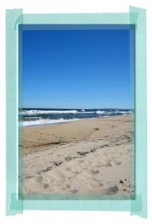
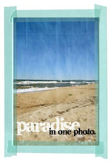
It was mainly just review work...you know, to check up on that we have remembered what we have learnt, for Jessica's class over the weekend. I have just done today's lesson about type and used this photo as my subject:First we added a grungy paper texture to our photos. This gave a really nice but subtle effect on the photo that I had picked and I really like it :) The effect is most obvious on the sky part of the photo. Looks a bit like a worn and folded old postcard or something... Then we were adding type to the photo and Jessica included a link to a nice font for us to download. This is where the class ended.
I then decided to add in an extra (faded) brush effect behind my title work just to add that little bit extra. I'm really pleased with how it turned out...
So simple to do, yet it's just finding that little extra time to sit down and play like this...which I guess doesn't happen very often.
I then decided to add in an extra (faded) brush effect behind my title work just to add that little bit extra. I'm really pleased with how it turned out...
So simple to do, yet it's just finding that little extra time to sit down and play like this...which I guess doesn't happen very often.
Sunday, July 12, 2009
Playing With Textures...
Now this class lesson was very interesting! Playing with textures. This is not something I'm really familiar with. I think I have done it once or twice before, when I just started learning digital scrapping, but it's seriously something I would have had no clue on how to start with even...
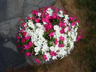
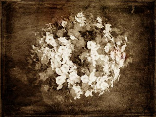
I used a very basic flower photo (above) as my start photo and the first step was to convert it to a black and white photo. We were adviced that landscape type photos work best with textures. I guess it's pretty obvious if you think about it - you might not want to add texture to someone's face for example :)
Having added 3 different textures, supplied by Jessica, and then got some ideas for how to play with blending modes and our photos had taken on a totally different look from the originals.
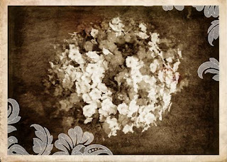
And as a final little bonus, she also supplied us with this cool frame with built in brush effect. I really love the idea of playing a bit more with textures, and I'm sure I will for the odd photo, but I guess it's just finding that time to sit down and do it. Also it's not something that you exactly want to do to most of your photos, just the odd one here and there which it might suit. :)
Saturday, July 11, 2009
Catching Up...
Hope you're all having a great weekend - I know I am :)
I got a little behind on the Jessica Sprague photo editing course over the last two days so I'm catching up on it now while doing some Creative Team work in between too :)
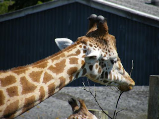
Lesson 4 was about using clipping masks. A pretty basic lesson, but I totally love clipping masks so definitely a fun lesson. It's something I use a lot while scrapping digitally so this was nothing new for me. Basically we started with a standard photo:
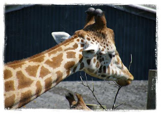
...and then added a clipping mask which gave it some great grungy effects with cool edges. Pretty subtle but at the same time a really nice option to a standard photo.
Oh and before I go...
"Chedder Fish" - you asked about the frames I used in my blog post the other day. You can buy them here. Hope that helps :)
Friday, July 10, 2009
Teletubbies...
My little niece is a HUGE teletubbies fan. She turned 2 earlier in the week and I wanted to make her a birthday card. I thought it would be really cool if I could make one with teletubbies. So I got some teletubbies and rabbit images and extracted them from the backgrounds. Then I used two very sweet digital kits from SSD and created a scene, added my teletubbies and rabbits and finished off the card. This is the result:
It turned out to be really popular (the way teletubbies are her favourites, I kinda knew it would be) and they have even talked about framing it for her. I decided not to put a birthday greeting on the front as I thought she might want it on a bookshelf for a while or something, and now they are talking about putting it in a frame I'm really glad I made that decision.
[Supplies: Lil' Buggy - Traci Reed, Kristin Cronin-Barrow, Down By The Pond - Lauren Grier, Lliella Designs (both SSD)]
It turned out to be really popular (the way teletubbies are her favourites, I kinda knew it would be) and they have even talked about framing it for her. I decided not to put a birthday greeting on the front as I thought she might want it on a bookshelf for a while or something, and now they are talking about putting it in a frame I'm really glad I made that decision.
Wednesday, July 08, 2009
Vintage Hand-Tinted Look...
Oh this was fun! Day 3 of the photo editing class by Jessica Sprague and we learn how to add a vintage hand-tinted look to a photo (the frames that I have used have nothing to do with the class at all - just something I added myself).Using adjustment layers (which is what to do to create this effect) is something that I have done before. But never to a point where I have really learnt in...you know, in a way where I would remember how to do it later. I've kinda done it, followed the instructions and then forgotten it all a few days later. So I really enjoyed this lesson. It's definitely the kind of thing I would like to take more time to learn more about. It's just finding the time in the first place I guess :)
It's not so obvious here because I have had to make the photos rather small to fit well on the blog, but... In real life, working with the full size photos, it's really amazing what a big difference a little tinting etc can make to the general feel of the photo...
Having done this lesson today, I'm really looking forward to what tomorrow's subject might be.
On a totally different subject, I'm also working hard on some CT assignments. Making cards, digital layouts, bookmarks etc. So I will have lots of new stuff to show you over the next week or so. Got to continue with all this today so I better get going... :)
Tuesday, July 07, 2009
Playing With Brushes...
The second day of the class...and time to play with brushes... I totally love brushes and the effects you can get with them. The best thing for me is to use smaller brushes to build up your own frames. :)
Again the subject is something that I'm already familiar with. I'm not an expert at all, and I would love to learn a lot more about it, but I know the basics for it at least. Rather than using the brush set that Jessica Sprague supplied for the class, I used some brushes that I downloaded a long time ago.
I think it's a fine line between what looks nice and what looks "too much" when it comes to brushes. The photo above definitely have the "too much" look for me. I was going to re-do it, but then I thought it might be a good example of what doesn't really work. :)
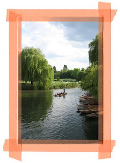
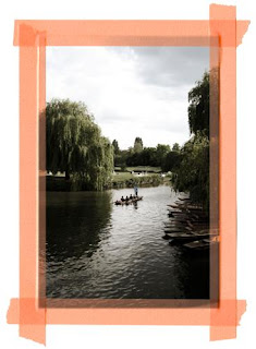
The photos that I have used to play with brushes on were taken mid May this year in the Oxford/Cambridge area. The one above and below are taken at a National Trust place. The weather was perfect and we went for some nice long walks :)
Right I'm off as I have some Creative Team assignments to work on...
Monday, July 06, 2009
Playing With Frames...
So it's the first day of class. I've just gone through the first class video and even though it was pretty basic stuff, which I already knew (playing with frames and adding wordart), I still really enjoyed it. It's just nice to take some time out and sit for a few minutes playing with photos. I find that it's something that I don't do often enough (simply because of time).
Some of our pansies had seen better days so I pulled them out of out outside plant pots yesterday and off we went to the local garden centre to get something new. But it was pretty empty and we didn't really spot anything we liked... so we ended up going to a second garden centre and in the end we got this pretty fuchsia...
I've just been out taking these photos, this morning, to use for the first day of class. They fit perfectly, even if I had to recolour the supplied frame a bit to fit with the colours of the photo. I don't really think an orange frame would have looked quite so good :)
Saturday, July 04, 2009
Looking Forward...
I had hoped for a weekend with really nice weather but it doesn't look like it's meant to be. Instead we have it decently warm but rather unpredictable...sun, clouds and the odd bit of rain...rather humid too. So I guess it's good that I have something like this to look forward to this summer:
...and talking about looking forward to things, I'm also looking forward to Monday. Monday is the start of Jessica Sprague's "Photo Editing: Frame-Ups & Special Effects" class. It's a free two week photo editing class which I'm really excited about :) (I do believe that if you haven't signed up already, it's too late, the free registration was between June 22-28 only - sorry!) Anyone else joining me on this adventure...? :)
Friday, July 03, 2009
Lilypad BYOC...
So it's that time again, the first Friday of the month and time for the Lilypad BYOC. Not surprisingly, some of the products this month have a very summery feel, which fits perfectly :)
Yesterday I was busy downloading some of the kits, tagging them and playing around with them. I really enjoy this special time each month and the excitement of finding out what colour combination that they have decided to go with etc. Anyway, this is the layout that I came up with:
The BYOC is the largest release of kits during the month and there's sooo much nice stuff to choose from. Still, I have tried my best to pick out my 3 most favourite kits. 2 of them were really easy....the 3rd one I was picking from about 4 different ones. Tricky! Anyway, I have made my decision:
I just love this kit by Amy Wolff. Both for the newsprint aspect and for the elements aspect. Flowers always, always works no matter what you do (and yes I totally believe in that you can have flowers on male layouts too!)
Kate's doodle kits. What can I say? They are amazing as always. :) For this BYOC she doesn't have one but two beach related doodle kits. Both equally as good. Also she's brought out a super cute stripey alphabet - go check it out :)
...and finally these great masks by Amy Martin. Great both for photos or as masks for patterned papers etc. So very versatile and useful :)
Yesterday I was busy downloading some of the kits, tagging them and playing around with them. I really enjoy this special time each month and the excitement of finding out what colour combination that they have decided to go with etc. Anyway, this is the layout that I came up with:
[Supplies: Summer Medley - Anne deJong, Messy Paints 2 - Amy Martin, Messy Sprays - Amy Martin, Epoxy Dates - Amy Wolff, Half Ripped Minis - Amy Wolff, The Weekly Gazette - Amy Wolff, Sprayed Alpha & Numbers - Jenna Desai, Rough & Rusty Papers - Jenna Desai, Newsies - Jacque Larsen, Sandy Toes - Kate Hadfield (all from the Lilypad)
The BYOC is the largest release of kits during the month and there's sooo much nice stuff to choose from. Still, I have tried my best to pick out my 3 most favourite kits. 2 of them were really easy....the 3rd one I was picking from about 4 different ones. Tricky! Anyway, I have made my decision:
I just love this kit by Amy Wolff. Both for the newsprint aspect and for the elements aspect. Flowers always, always works no matter what you do (and yes I totally believe in that you can have flowers on male layouts too!)
Kate's doodle kits. What can I say? They are amazing as always. :) For this BYOC she doesn't have one but two beach related doodle kits. Both equally as good. Also she's brought out a super cute stripey alphabet - go check it out :)
...and finally these great masks by Amy Martin. Great both for photos or as masks for patterned papers etc. So very versatile and useful :)
Subscribe to:
Posts (Atom)