I think after spending, what felt like, half the weekend watching tips & tricks videos on Copics I feel like I have a pretty good idea what to do and not with my markers. Or at least much better starting point than never having seen a video. Still, I know that it's "practice, practice, practice" when it comes to these markers... so if there are any Copic experts out there I'd really appreciate some constructive criticism on my first attempts.
In the meantime I'm going to try and "judge" my own images myself and (to the best of my limited Copic knowledge) point out good and bad points LOL! This should be fun... Anyway, I dug out some of my old Magnolia stamps to practice with and stamped 5 images...
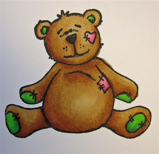 1. In general I was very pleased with my VERY first attempt on colouring with the Copic markers as I know some people just can't get enough of them. So, not trying to judge this one too harshly, I was pretty happy with it.
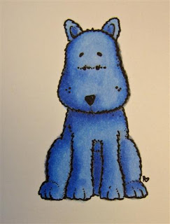 2. Second image and playing with blues. I really enjoyed the shading and I think I got that pretty OK considering. But by now I discovered what I believe is my biggest problem. I'm normally very good with colouring in and never go outside lines. I was fine with this too, UNTIL I came to adding more colours for shading and I then noticed that I pushed the colour outside the lines a bit (check out the outline of the dog's legs).
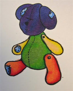 3. My third image and again you can see how, once I started adding more shades, I pushed the colour over the lines a little on the legs and arms. I also ventured into reds, having read that this is the hardest colour to blend nicely, and they were not wrong! Unhappy with the result. It might partially be that red is a hard colour to blend, but also to do with that I only had a pale red and then two pretty dark ones...a mid tone might have helped a bit here I think.
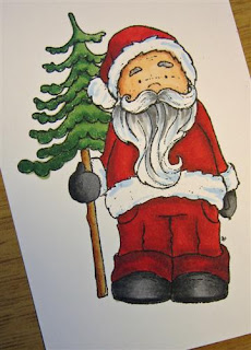 4. A bit more advanced colouring. (Please ignore the white bits, beard and on the jacket, I'm awaiting some pale shades so I really couldn't blend this at all!) I'm much more happy with my reds here. I'm also paying more attention to the "bleeding outside the lines". The tree trunk was good practice for this and I think it's improved a lot. I also need my pale shades as I think Santa looks a bit like he's spent the last 3 weeks on a very sunny holiday :)
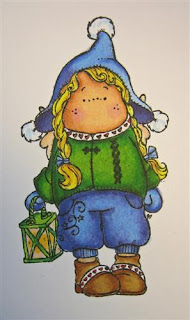 5. By now it was getting late at night and I did one final image. I was paying close attention to not bleed the colours over the lines. I'm pretty happy with the shading on green sweater and the shoes etc and if I'm going to be picky (and yes I am, being a perfectionist LOL!) I'm not so happy with the shading on the blue hat and trousers. Might be partially me and partially the fact that I was missing some blue mid tones, making it a little hard to blend nicely.
As I said, I would really welcome some constructive advice on my first coloured images please. Or any tips in general on what to avoid etc?
...also before I go I want to say a big THANK YOU to Jessica who left me some really helpful Copic advice the other day, thanks for taking the time to write :)
Now I'm off to finish this week's layout for Ali Edwards' class (hoping I can get it finished, photographed and on my blog tomorrow) and then I will play a little more with my pens.


8 comments:
Hi sweetie,
So I’m more a promarker girl – I find the price of the Copic just a little too steep for me but this tip should work the same with them.
What you want to do to hide the over spill & also “pop” the image is very carefully with the lightest colour you have in a blue or grey is go around the image it’s self so you have a little halo effect. It gives the image depth.
And if you have a white pen that will go over dark colours can’t for the life of me remember which one I use (I’m not home to look, I have to work boooo) you can make high lights I mostly use it for eyes to give them the white dot that gives them life, if you know what I mean, but you can also use it sparingly on the image where the light who hit it.
Another trick is to take a photo of a similar object so you can actually see where the light hits it, which as most people have digital cameras is a quick solution and always start with your lightest colour 1st and build up the shading.
But you’re doing great so far!
Oh another good trick as you build your stash is just get a page of the same paper you like to stamp on and make yourself a colour chart so you can see how the colours work & you don’t buy doubles!
Anyhoo better get back to the grind stone Hope that helped a bit Seeya Hugya *G*
Fab Anso xxx
Anso amazing colouring for your first go, way better than my last, think you are going to be a natural. Great tips from grungedandy though.
Pinky
Very nice for a first try!! I was wondering which ink you used to stamp the images? The wrong ink can also lead to 'bleeding' images...stazon for example is not a good one to use with copics. Most people use Memento ink.
I agree with grungedandy! Great idea for making a color chart.
Also the idea about shading around the image to give it depth. And it does hide the spill overs. With many colors you can use the clear marker to 'push' the color back into the lines. But it doesn't work with black and deep dark shades. They tend to leak out more. But if you find that you've gone out of the lines, wait until it dries and use the clear marker to push the color back in. It amazed me how well it works. But you have to be sure that your blending marker isn't over full if you do that. I tried it right after a refill and had a disaster! lol
You are quite welcome for the advice. I'm glad I could help. I think you are doing very well for your first try. You're doing way better than I did! I still follow the ilikemarkers blog and I learn something new every time she has a post.
Your little critters are very cute and well done. I think the floppy eared one was maybe a little too colorful, that may be why you had trouble with him. But he is still cute. And you've done a great job. Oh and you've got a great selection of markers too!
very cute
Wow really good first attempt. I love my copics!
Post a Comment