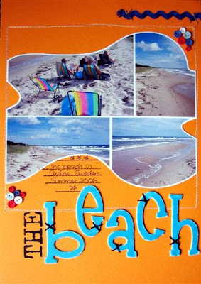
.jpg) Because of the photo shape I wanted to keep the layout quite clear and uncluttered so the photo could be the main focal point and I hope/think I have achieved this. I keep wondering if it's too plain, but I'm resisting the urge to add some more to it LOL! Can you believe that a year ago I would never EVER have scrapped a bright orange layout!! Sorry I have got some funny light in the picture - the top of the layout should not be that dark. Supplies are: Bazzill Doodlebug cardstock, Pressed Petals chipboard letters, Autumn Leaves "Stitched Panels" journaling stamp, Zig Millennium pen and some buttons, ric rac & embroidery thread. Oh and my sewing machine of course - love it!!
Because of the photo shape I wanted to keep the layout quite clear and uncluttered so the photo could be the main focal point and I hope/think I have achieved this. I keep wondering if it's too plain, but I'm resisting the urge to add some more to it LOL! Can you believe that a year ago I would never EVER have scrapped a bright orange layout!! Sorry I have got some funny light in the picture - the top of the layout should not be that dark. Supplies are: Bazzill Doodlebug cardstock, Pressed Petals chipboard letters, Autumn Leaves "Stitched Panels" journaling stamp, Zig Millennium pen and some buttons, ric rac & embroidery thread. Oh and my sewing machine of course - love it!!
Tuesday, April 24, 2007
Playing with photos...
Had some time yesterday afternoon to sit down and play around a bit with my new "Computer Tricks" book and Photoshop Elements 5.0. Being totally new to PE it's a bit confusing but I'm having lots of fun learning. Went through a tutorial of grouping photos together and then cutting them out in a fun shape (imagine like taking a cookie cutter - which is indeed what the tool is called - and using that over your photo collection). Managed to go a few quite fun examples...one of which I printed out and made a layout with this afternoon.
.jpg) Because of the photo shape I wanted to keep the layout quite clear and uncluttered so the photo could be the main focal point and I hope/think I have achieved this. I keep wondering if it's too plain, but I'm resisting the urge to add some more to it LOL! Can you believe that a year ago I would never EVER have scrapped a bright orange layout!! Sorry I have got some funny light in the picture - the top of the layout should not be that dark. Supplies are: Bazzill Doodlebug cardstock, Pressed Petals chipboard letters, Autumn Leaves "Stitched Panels" journaling stamp, Zig Millennium pen and some buttons, ric rac & embroidery thread. Oh and my sewing machine of course - love it!!
Because of the photo shape I wanted to keep the layout quite clear and uncluttered so the photo could be the main focal point and I hope/think I have achieved this. I keep wondering if it's too plain, but I'm resisting the urge to add some more to it LOL! Can you believe that a year ago I would never EVER have scrapped a bright orange layout!! Sorry I have got some funny light in the picture - the top of the layout should not be that dark. Supplies are: Bazzill Doodlebug cardstock, Pressed Petals chipboard letters, Autumn Leaves "Stitched Panels" journaling stamp, Zig Millennium pen and some buttons, ric rac & embroidery thread. Oh and my sewing machine of course - love it!!
Subscribe to:
Post Comments (Atom)


1 comment:
ooo you clever thing, your getting the hang of the PE5 now, LO looks just fab! Catching up on all your great work :D
Post a Comment