Last week I started putting together my Christmas journal. I always make my covers from scratch (cardboard cut to size and then cover each bit with patterned paper inside and out). This is my journal for this year:
I know the book rings look giant at the moment. But trust me, they will look just right once the album is finished and all the pages are completed. My Christmas journal always end up needing BIG book rings or the widest BIA wires available.
The back cover is very simple. With a cute polar bear paper and a stamp/signature/date.
I really enjoyed the journal I did last year so I went with the same concept and kept the cover size the same too. It's 16 cm wide by 23 cm tall.
Please come back tomorrow if you want to take a peek inside it... :)
Monday, November 30, 2009
Sunday, November 29, 2009
Comparing Yesterday And Today...
This was a cool layout to do for Ali Edwards' BPS class. A topic I don't think I would have thought about otherwise...
The project was a single 12x12 layout (something I don't normally scrap, unless we're talking digital layouts). And Ali invited us to do a layout which featured both "yesterday" and "today". It was suggested that we'd pick "something" and then compare it "in the past" with "today". Was this "something" the same or different now?
I decided to scrap about my love for the colour GREEN and how it's never changed. It's been my favourite colour since I was very, very little and it's always stayed my favourite colour :)
Friday, November 27, 2009
Baby It's Cold Outside...
The other day I told you that I was working with a very cute winter collab by Kate Hadfield that was going to be released this Friday. Which is today :) So I'm now free to show you the layout and the kit I was talking about. Firstly, here is what I created...
As the main kit I used the "Bundle Up" collab by Kate Hadfield and SMJ Designs. Really, if you like cute snowmen etc you should check out the kit and the bigger preview picture here.
And, as we all know that Kate's doodles are some of my favourites to scrap with, I just must show you her other collab that was also released today. It's called "Fa La La La La!" and if you want to check it out you can find it here.
Such great colours! I've just downloaded it and plan to sit down and create something with it after the weekend. :)
[Supplies: Bundle Up - Kate Hadfield, SMJ Designs, Postage Frames - Amy Martin, Flossy Mess - Karah Fredricks (all from The Lilypad)]
As the main kit I used the "Bundle Up" collab by Kate Hadfield and SMJ Designs. Really, if you like cute snowmen etc you should check out the kit and the bigger preview picture here.
And, as we all know that Kate's doodles are some of my favourites to scrap with, I just must show you her other collab that was also released today. It's called "Fa La La La La!" and if you want to check it out you can find it here.
Such great colours! I've just downloaded it and plan to sit down and create something with it after the weekend. :)
Thursday, November 26, 2009
My Cool News...
I hinted yesterday that I'd got another position on a Creative Team...
I'm really excited to share that I'm now part of the Lliella Designs Creative Team. If you're a follower of my blog, you will already have seen several projects that I have made with Allie's great kits. I'm a huge fan of them so I was jumping up and down when I got the e-mail from her :)
If you're into cute things (like I am!) then you really must check out Lliella Designs. But be warned, you won't be able to resist... so bring your credit card :)
These are her two latest super cute winter kits which I have been working with for my very first official CT layout:
...and here is what I came up with:
Wednesday, November 25, 2009
Polka Dots...
I love polka dots and anything with a circle/spot pattern. The Swiss Dotted Bazzill is great and I can't get enough of my dotted Cuttlebug embossing folder. So I was very happy to work with some of Shimelle's great polka dot papers this week:
I've had a bit of a digital scrapping day today. Earlier this morning I worked with a new collab from Kate Hadfield. It's seriously super cute and wintery. You really must check it out when it's released on Friday :)
I have also had some great news, I'm the new member of another Creative Team too. It's someone who's kits I have scrapped with in the past and enjoyed a lot... I'm seriously excited about this!! More news will come very soon :)
[Supplies used: Autumn Apples Embellishments - Shimelle Laine, Autumn Apples Polka Dot Papers - Shimelle Laine (both from 2Peas), Scrap Pad - Polly Love 4 - Amy Martin (from The Lilypad), Bejewelled - Fee Jardine, Jingle Baby - Kristin Cronin-Barrow, Meghan Mullens
(from SSD)]
(from SSD)]
I've had a bit of a digital scrapping day today. Earlier this morning I worked with a new collab from Kate Hadfield. It's seriously super cute and wintery. You really must check it out when it's released on Friday :)
I have also had some great news, I'm the new member of another Creative Team too. It's someone who's kits I have scrapped with in the past and enjoyed a lot... I'm seriously excited about this!! More news will come very soon :)
Tuesday, November 24, 2009
Making Christmas Cards...
I have just finished this week's double layout for Ali Edwards' BPS class (great layout design!) and in a bit I'm going to start working on this year's Christmas card prototype. This is cards for family only and every year I make a prototype first. Then we pick one weekend and me & Ross sit down and make all the cards based on this prototype card (while playing Christmas music of course!) A very cosy tradition and I feel so happy (and lucky!) that we do it together.
And talking about Christmas cards, here's a hybrid card which I made late last week using a super cute kit by Mindy Terasawa:
Before I get started on designing this year's Christmas cards I just wanted to say thanks to Kerry who left a comment and mentioned that Eclipse (the 3rd film in the Twilight saga) is due to premiere on July 9th 2010. I hadn't got as far as starting investigating that yet as I figured it must be about a year away. Really pleased to read that it's so "soon". :)
And talking about Christmas cards, here's a hybrid card which I made late last week using a super cute kit by Mindy Terasawa:
[Supplies: I Believe - Mindy Terasawa, Jolly Lil Friends - Mindy Terasawa (both from Designer Digitals)]
Before I get started on designing this year's Christmas cards I just wanted to say thanks to Kerry who left a comment and mentioned that Eclipse (the 3rd film in the Twilight saga) is due to premiere on July 9th 2010. I hadn't got as far as starting investigating that yet as I figured it must be about a year away. Really pleased to read that it's so "soon". :)
Monday, November 23, 2009
New Moon...
Thanks for all the birthday wishes! I had a great birthday on Friday and it ended perfectly by going to watch the premiere of New Moon. I've had a few questions on what I thought of the film, so....
In one sentence: I loved it!! When I saw the trailer, earlier in the year, I was a bit "worried" that the wolves didn't look like they were described in the book. As in, they did not look very big. However I was really pleased to see that in the film they did indeed appear much bigger than a normal wolf :)
The story was great. Of course. As we all know who love and have read the books. So there's not so much to comment on that bit. I think it was pretty close to the book story. But there were a few little details/parts where I found myself thinking "hey that's not in the book!"
One thing that I always find myself wondering about though (and the same goes for the Harry Potter films too, maybe even more so) - how much sense would the film make to someone who's not read the books? How many little bits do you not pick up on or get? But then again, I guess most people who would go and watch it are fans of the books anyway :)
Another thing that I keep thinking about though... You know how you read a book and picture the characters in your head and they look a certain way? Robert Pattinson just isn't Edward to me!! Don't get me wrong. He's a great actor and acts a very good Edward... he just looks all wrong to me :( Everyone raves about how great he is as Edwards so I must be the only person in the world who thinks this. LOL! Taylor Lautner on the other hand - great, great Jacob. Both the acting and the looks - perfect fit to my imagination :)
I definitely loved the film and I'll be there getting my copy when it's released on DVD :)
Right I'm off as I'm busy working on my Christmas journal. Putting together all the pages and making the covers from scratch. Quite a task.
Saturday, November 21, 2009
Copics With Printer Ink...
I posted the other day about experimenting with using my Copics and images printed using my printer as I had heard conflicting reports on whether the Copics made printer ink bleed or not...
I made this card using supplies and digital stamps from Sweet Shoppe Designs and started off with 4 digital stamps (ie. just the black outlines). I printed this onto the usual cardstock that I use with my Copics (Georgia Pacific) and I used my Canon printer (I always use genuine Canon ink).
Ooops...looks like I should have done more of a close-up on what Copic colours I used - sorry about that :( Hope you can still make them out.
Anyway, I took great care in not necessarily colouring over or on top of the lines, so I guess you could say that I was pretty careful, but... for me, Copics and my printer worked just fine! I'm so excited about this as it means a who new world is open to you with all the digital stamp designs too :)
Of course I can't guarantee that this will work for everyone and different cardstock and/or printer/ink might not give the same results. The little experience I have had with "compatible printer ink" (which I really won't touch since then!) makes me think that this could possibly have a worse result too... but as I said, I really don't know.
If you want to try for yourself I would just recommend being very careful at first (you don't want to ruin your expensive markers!!) and go very carefully up to the printed lines. Colour a little and then wait and see what happens before you colour the whole image and potentially could suddenly find yourself with your marker tip stained with printer ink (horror!!).
...I also used a Spica At You glitter pen to go over some parts of my coloured/shaded images. You can never have too much glitter :)
I hope this little experiment and the info was useful to some of you. :)
[Supplies: Tinsel Town - Melissa Bennett, Tinsel Town Stamps - Melissa Bennett, Oh Christmas Tree - Lauren Grier, Sweet Holiday Digital Stamps - Julie Billingsley (all from SSD) ...plus Copic markers.]
I made this card using supplies and digital stamps from Sweet Shoppe Designs and started off with 4 digital stamps (ie. just the black outlines). I printed this onto the usual cardstock that I use with my Copics (Georgia Pacific) and I used my Canon printer (I always use genuine Canon ink).
Ooops...looks like I should have done more of a close-up on what Copic colours I used - sorry about that :( Hope you can still make them out.
Anyway, I took great care in not necessarily colouring over or on top of the lines, so I guess you could say that I was pretty careful, but... for me, Copics and my printer worked just fine! I'm so excited about this as it means a who new world is open to you with all the digital stamp designs too :)
Of course I can't guarantee that this will work for everyone and different cardstock and/or printer/ink might not give the same results. The little experience I have had with "compatible printer ink" (which I really won't touch since then!) makes me think that this could possibly have a worse result too... but as I said, I really don't know.
If you want to try for yourself I would just recommend being very careful at first (you don't want to ruin your expensive markers!!) and go very carefully up to the printed lines. Colour a little and then wait and see what happens before you colour the whole image and potentially could suddenly find yourself with your marker tip stained with printer ink (horror!!).
...I also used a Spica At You glitter pen to go over some parts of my coloured/shaded images. You can never have too much glitter :)
I hope this little experiment and the info was useful to some of you. :)
Friday, November 20, 2009
Birthday Copics...
It's my birthday today and I have been totally spoilt so far. Some great books, a super beautiful eyeshadow set by Urban Decay (I just looove their colours and it's one of my two favourite make-up brands!), a computer game which is so "me" that I just know I will love it, the cutest Christmas teddybear, the official movie guide book to New Moon etc etc.
And for those Copic crazy people out there (I SO know the feeling!) I got some new Copics from my parents:
Yum, yum! Apologies for the photos being quite grainy, the light is terrible here today because of the not-so-nice weather.
Tonight we're off out for a nice meal and then we have tickets for the premiere of New Moon - can't wait.
PS. If you're waiting for the report on the Copics/printer ink experiment, please check back tomorrow :)
Wednesday, November 18, 2009
Going To Play With My Copics...
A little update before I'm going to play with my Copics. I've got some new digital stamps from Sweet Shoppe Designs which I want to try out. I've heard different opinions on whether printer ink bleeds with Copics or not so it will be an interesting experiment :)
Thanks for yesterday's comments :)
Cindy - you said my reaction to the vaccine scares you. Really, I wouldn't let it. I'd been told that arm pain was a really common side effect so nothing unusual. It feels lots better again today. Apart from that I have not felt any major side effects. Just a bit "run down" on and off, like I'm coming down with something. Small hints of a sore throat and headache at times and on and off my energy is more like 70-90 % rather than 100%. But that's all. I'd much rather cope with that while my body is dealing with the vaccine rather than full blown flu.
Right, I'm off to play with my Copics... :)
Tuesday, November 17, 2009
Tuesday Blogging...
I've been busy working on some digital layouts and hybrid cards this week. Fun! Also handy since my left arm is a little out of action. I had the H1N1 swine flu vaccine on Saturday morning. Didn't feel a thing until in the evening when my arm started to get sore (I'd been warned this was a common side effect).
By the next day I had a tennis-ball-sized round red mark on my arm which was really hot and my arm was really sore (like a mega sore giant bruise - only there was no bruise visible). It got more and more sore over 48 hours and I have struggled to sleep because of it. This morning, finally, I think it's turning for the better. The mark is still there, red and very hot, but I think the pain is slowly starting to fade. Yay! I have felt a little less energetic and slight hints of headache at times but otherwise fine :)
Anyway, over to some of the digital scrapping I did, and a layout done for Sweet Shoppe Designs:
Marlene - left a comment on this post for my 3rd journal for Karla Dudley's class and wondered if she'd missed photos of the previous two journals I made? You did indeed. You can find all three journals here:
* Journal 1
* Journal 2
* Journal 3
Hope that helps :)
By the next day I had a tennis-ball-sized round red mark on my arm which was really hot and my arm was really sore (like a mega sore giant bruise - only there was no bruise visible). It got more and more sore over 48 hours and I have struggled to sleep because of it. This morning, finally, I think it's turning for the better. The mark is still there, red and very hot, but I think the pain is slowly starting to fade. Yay! I have felt a little less energetic and slight hints of headache at times but otherwise fine :)
Anyway, over to some of the digital scrapping I did, and a layout done for Sweet Shoppe Designs:
[Supplies: Journaling Pack - Darcy Baldwin, Jingle Baby - Kristin Cronin-Barrow, Meghan Mullens, Ruled Alpha - Lauren Reid, Layered Up In You: Stripes - Lauren Grier, Inspired By Rebecca - Lauren Reid, Jingle Masks - ScrapKitchen, Winter Wonderland - Zoe Pearn
(all from SSD)]
(all from SSD)]
Marlene - left a comment on this post for my 3rd journal for Karla Dudley's class and wondered if she'd missed photos of the previous two journals I made? You did indeed. You can find all three journals here:
* Journal 1
* Journal 2
* Journal 3
Hope that helps :)
Sunday, November 15, 2009
A Lilypad Layout...
I hope you're all having a great weekend :)
I got some super cute photos of my little niece when mum & dad took her to a place where you could look at/stroke farm animals. They also had this wooden horse toy which became very popular :)
...I thought the photos went perfect with some of the farm/cowboy themed doodles that Kate Hadfield released as part of Lilypad's BYOC for November.
Ooops nearly forgot:
Gemma - you asked me what version of Photoshop I was running and how that went with Windows 7. First of all I have to say that I love Windows 7 and everything is running smoothly. I used Windows XP for a very long time. I felt no need to swap to Vista. But then I got my new laptop about a month ago and that had Vista on it. Swapping from XP to Vista was quite different LOL! But going from Vista to 7 is no problem at all. Most things feel pretty familiar straight away :) As for Photoshop, I use PSE 7 and it works just fine :)
I got some super cute photos of my little niece when mum & dad took her to a place where you could look at/stroke farm animals. They also had this wooden horse toy which became very popular :)
[Supplies: Hoopla Alphas - Amy Martin, In Stitches - Cori Gammon , Autumn TidBits - Jenna Desai, Stuck Together Little Minis - Karah Fredricks, Pick Of the Patch - Kate Hadfield , Ride 'Em Cowboy - Kate Hadfield, Art House Papers - Lauren Reid, Snip-Its - Valerie Wibbens
(all from The Lilypad)]
...I thought the photos went perfect with some of the farm/cowboy themed doodles that Kate Hadfield released as part of Lilypad's BYOC for November.
Ooops nearly forgot:
Gemma - you asked me what version of Photoshop I was running and how that went with Windows 7. First of all I have to say that I love Windows 7 and everything is running smoothly. I used Windows XP for a very long time. I felt no need to swap to Vista. But then I got my new laptop about a month ago and that had Vista on it. Swapping from XP to Vista was quite different LOL! But going from Vista to 7 is no problem at all. Most things feel pretty familiar straight away :) As for Photoshop, I use PSE 7 and it works just fine :)
Saturday, November 14, 2009
The Third Journal...
We've now been through the third and final week for Karla Dudley's journal class and I have finished my third and last journal for the class. I thought I would show you some work-in-progress photos so you can see how the journal is built up and then some photos of the finished item.
The third week/third journal was definitely the most advanced one. Using the most cool techniques too. I was really hoping that Karla would show us how to do one of her "sewn journals" so I was really pleased to discover that this was the journal for the final week :)
She supplied us with a cover to print off and some digital stamps that we could use to create some pages for the inside of the journal (which I did - I decided to pick the same orange colour that was used on the cover).
The closure of this book is really cool. Some embroidery thread which is weaved in and out of the covers and then tied in a bow. The cover itself is white with black, grey and orange printing on it.
The book itself is made up of three signatures with their own individual "covers" (you can see the 1,2 and 3 covers in the first and second photo). Each signature contains 5 double-folded pieces of cardstock.
Then each signature is attached to the book cover by sewing through some holes in the spine (loved this part!) I used the same black embroidery floss as I used for the closure.
The finished journal has loads of pages, a sturdy cover and is 10x10 cm. Super cute I think :)
In the photo above you can see how the thread that holds the journal shut loops in and out through the cover. Oh and I used some old Chatterbox paper to line the inside of the cover.
Hope you enjoyed the little tour of my latest journal :)
Thursday, November 12, 2009
Exciting News - Shimelle's Digitals...
I've been dying to tell you ever since Saturday when I got the e-mail from Shimelle that I'd made her Creative Team! :) Today is the official day that we can announce it :)
The Baker's Dozen are the following talented ladies: allison, anso (me!), avital, elisa, helen, karen c, karen l, karen m, kate, nadine, rani, sheri and yvonne. We'll be working with digital elements from Shimelle's ever expanding shop at 2Peas. It feels like a great new adventure and I'm sure we'll all have lots of fun together :)
As a joint little first job we all had a mission to create a page using the same kit - Long and Winding Road and above is what I came up with.
Can't wait to see what new goodies Shimelle has got in store for us in the future! :)
The Baker's Dozen are the following talented ladies: allison, anso (me!), avital, elisa, helen, karen c, karen l, karen m, kate, nadine, rani, sheri and yvonne. We'll be working with digital elements from Shimelle's ever expanding shop at 2Peas. It feels like a great new adventure and I'm sure we'll all have lots of fun together :)
[Supplies: Autumn Apples Polka Dot Papers - Shimelle Laine, Long And Winding Road Shimelle Laine, Long And Winding Road Add-On Kit -Shimelle Laine (all 3 from 2Peas), Inked Edges - Jenna Desai, Stuck Together Little Minis - Karah Fredricks, Tall & Skinny Alpha - Kate Hadfield (all 3 from The Lilypad), Grungy Edges 5 - Penny Springmann (from SSD)]
As a joint little first job we all had a mission to create a page using the same kit - Long and Winding Road and above is what I came up with.
Can't wait to see what new goodies Shimelle has got in store for us in the future! :)
Wednesday, November 11, 2009
You Should Know... Part 2...
Thanks for all the comments on yesterday's layout with no photos. I really enjoyed this class lesson. And as I said yesterday, I enjoyed it so much that I decided to create a second version.
There were two reasons for creating a second version. The first one was purely because I liked it and I wanted to make one for my other half too - thought that would be really cool to have a page for each of us. And the second reason was because it's a 6x12 layout, which of course uses a 6x12 page protector. And since Ali said that there's no other 6x12 layout planned for the rest of the class, I thought I might as well do something to go on the other side in the page protector. So I did the class twice.
I got Ross to write down his own facts and then I used them to create a similar page to mine. I went with the exact same format, stitching etc. I kept the greens in the papers but instead of going down the pink/green route I made this with the more male blue/green combination. It looks so cool in the album to have a page for us each :)
Right I'm off. I've got lots to prepare for tomorrow as I have some exciting news, I got at the weekend, to share then! :) There might just be an update tomorrow afternoon... you know...say... perhaps around 16:00 UK time (4 pm)... or something like that... maybe... *wink* Shhh! LOL!
Tuesday, November 10, 2009
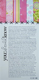
You Should Know...
Greetings from Windows 7! Since my laptop is so new, I got a free upgrade to Windows 7 with it which arrived yesterday. I spent the evening installing it and everything seems to run smoothly so far :)
Last week's lesson by Ali Edwards was really cool. A photo-less layout. She was talking to us about how normally a layout has photos + words. And sometimes we do a layout with lots of photos and no real journaling. But that no-photo layouts also have a place in our albums. I'm trying to think if I have ever made a layout with no photos before and I'm really not sure if I have.
The layout which she suggested making was called "You Should Know". A really fun concept which I'm not sure I would have thought of otherwise. Just lots of one line, numbered, random facts about yourself. Then, again randomly, making a few of the sentences/facts in a larger font. Some patterned paper bits added to the top and then I finished it by hand-stitching across the border. I'm so happy with the result that I made another version of it which I will show you another day :)
Monday, November 09, 2009
A Layout And Some More Questions...
I'll get straight to the questions I think. Oh and thanks for all the comments once again - love getting comments :)
Jo Sowerby - asked if I find Copics better than Promarkers? Right. Honestly? I have no idea as I have never owned or even held a Promarker LOL! From having done a LOT (and I do mean an awful lot!) of research on Copics before I bought some, I do know that most people prefer Copics to Promakers. But that's all I can really say, as I said, I have not tried them myself.
Melissa - was asking what border punches that I used for this journal. They are all by Martha Stewart. I have quite a few and unfortunately the names are not written on the punches (the packaging is thrown a long time ago). Having said that, this is not the first time I have been asked about the border punches so maybe I should take some time one day to sit down and try to work out the names of them and add a sticker to the bottom or something...
Lizzie - yes you are right about the closure on this journal and that you have to do the fiddly bit with threading the thread through the button each time. I did react to this too when I saw Karla making the journal. That it would be a bit fiddly to open and close. But I did think it looked very neat so I decided to go for it anyway. Also (since the button is quite big) I made quite big holes so it's not too fiddly to get the thread through :) That was the best I could do.
Before I go, here's a layout I have made with the November BYOC kits at the Lilypad:
[Supplies: Hoopla Alphas - Amy Martin, In Stitches - Cori Gammon , Plaid-Ingo - Emily Merritt , Autumn TidBits - Jenna Desai, Pick Of the Patch - Kate Hadfield, Ride 'Em Cowboy - Kate Hadfield , Hand-Drawn Frames - Designs By Lili, Art House Papers - Lauren Reid, Bark - Valerie Wibbens
Snip-Its - Valerie Wibbens (all from The Lilypad)]
Saturday, November 07, 2009
Scrapping About Difficult Topics...
I never got the chance to take photos of my layout for Ali's class last week until yesterday so here we go...
The 3rd week of Ali's BPS class was great. Very challenging but great! You know when you put something off because you think it's very hard... too hard... and then you do it and then you feel so great afterwards? Well Ali encouraged us that it's important to get difficult things into our scrapbooks too. It quite often helps us to write about them and afterwards it feels great having documented them. At first I panicked about this subject. I didn't know what to write about. But as soon as I saw Ali's own layout (featuring a health problem which I won't mention here just in case) I knew what I was going to document...
Something that I have been wanting and meaning to get down on paper for the last year. Something that I just didn't know how to start dealing with, what to document, what to not. I was scared of writing things down and seeing them in black and white, yet at the same time I wanted to have it all documented in one place...
My severe eye condition that I was diagnosed with back in October of last year.
Apologies for all the blacked out lines on this layout. It contains far too much personal information to put out on the internet LOL! I had a lot of information, dates and photos I wanted to make sure were featured. Ali's layout only contained text on one side and one large photo (instead of 6 that I used in the place). So I doubled my text over 2 pages and printed 12 smaller photos. Photos showing how bad I saw at different times, my official appointment papers, prescriptions, coming back with a plastic shield taped over my eye after both laser surgeries etc. The text describes the last year with as much information as I could fit, including dates. On each side (where you see the black lines on the bottom left and right) I used a date stamp to stamp out all my hospital appointments with the specialist, plus after some of them I made little notes, by hand, referring to the specific visit.
This was hard. This was something I wanted to do. This was something I was dreading to do. But I'm SOOOO glad I did this layout. I felt great afterwards, having all the info in one place, and I'm really, really grateful to Ali for making me take that step to do it. Unfortunately it looks like my eye problems have not ended here so who knows, maybe I have to do a follow up layout some time later.
If you have something similarly hard to document, but something you really want to get down on paper, I really encourage you to sit down and get it done today. It will make you feel so good afterwards. :)
Friday, November 06, 2009
The Second Journal...
I have finally had the chance to grab a camera and take some photos of the second journal for Karla's class that I made. This one was quite different and took a lot longer time to make than the first one. It included a lot more pages inside and the spine was glued instead of stapled.
Because it has so many pieces of cardstock inside (40+) I couldn't get the journal to lay open (flat) while taking photos of the inside (and I don't have three or four hands to hold the journal open AND take photos at the same time LOL!), so instead I will show you some of the inside pages before they went into the album.
Some were totally plain... just white cardstock. Others were also plain but I used a variety of border punches on the edges. And then rest were stamped with some digital stamps that Karla supplied, then printed and cut to size. These were then randomly mixed throughout the book.
The finished book is 10x 10 centimetres and turned out really cute. The cover is designed by Karla and the spine is covered by some "Love Elsie" fabric paper.
If you look carefully at the photo below you can see the different "lengths" of the pages at the right side of the book - this is because some of the pages have the fancy border-cut edges.
The closure for this book was really cool and probably a bit hard to explain in photos/words, but I'll try... Two eyelets were put through the back cover and the string (embroidery floss) is looped through them...
Then it comes up and over the pages on the outside (right side as you look at the book), only to go INSIDE the front cover, come UP through the button holes and it's then finally tied in a bow on the front of the button/cover :)
A pretty neat way of a closure which I have never seen before. I hope my explanation together with the photos explained it well enough. :)
Have a great weekend everyone! :)
Wednesday, November 04, 2009
My Christmas Journal...
I have had a few question regarding my Christmas journal (am I doing it this year? How? What? etc) so I thought I'd go through them and explain a bit, plus give some tips which I have learnt during the years.
First of all: yes I think I'd better do a journal this year too. If I have done it for a few years in a row I really can't stop now can I? :)
Spread through this post are a few images from last year's journal. This was what it looked like before I started adding things to it and this really worked for me.
Ali Edwards, Shimelle... or something else? I'm kinda going with my own version. I have done Shimelle's "Journal Your Christmas" in the past and will therefore get the prompts for free every year. Some days I will follow them, others not. Also her class goes onto the 6th of January. I find that I don't particularly need those last January days in my journal so I make my own adaptation. Then we have Ali Edwards and her "December Daily" album. This really appeals to me and I love what she does with her album but she ends on December 25th. Again this doesn't feel good to me as I really want New Year's Eve in my album. So last year I made my own version by going from Dec 1st to Dec 31st and that really worked for me. I got to feature the days I wanted without doing "days just for the sake of it". So I'm pretty sure I will got with my own 1st-31st format again. Also for each year I'm learning more and more to go with the flow, do what I want and stop worrying about what you "should" do. :)
Michelle asked me: when did I do the journaling/add photos and make the journal? The journaling and adding the photos I do on the day in question. So on the 1st of December I use a photo(s) from that day and journal about that day. On the 2nd of Dec I do that page and so on. As for making the journal. Before last year, I would make each page on the day of doing the journaling. Last year I took a different approach and made the journal (put together all the inside pages) before I started. This worked really well for me and I hope to do something similar again this year.
You can see some parts of making my journal from last year here:
Work In Progress - Christmas Journal 2008
Journal Ready To Use - Christmas Journal 2008
Finally Liberty asked if I would be using one of my journals from Karla's class as my Christmas journal? This is very easy to answer because it's a definite NO to that question. Why? Here comes one of my best tips for the Christmas album. Do NOT use a pre-bound album. No matter how non-bulky you make your pages, the album (with all the pages added) will turn out pretty bulky in the end anyway. You need something with a very wide spine, or something you have the option of changing along the way, or something you bind AFTER you have finished. This is just my personal opinion of course, but this is what I have learnt that I need myself. So I either go for bookrings (which I can later change to larger bookrings as I go along, if needed) or I don't bind my album as make it, but I bind it with my Bind-It-All afterwards (ie in January!)... normally needing the biggest o-wires available LOL!
So what am I doing this year? I wish I hadn't been so rushed off my feet at the moment that I could sit down and start making my album. I'm really looking forward to do this and I'm itching to start. I just need to find the time. Anyway, this is what I *think* I'll be doing:
* making my own covers totally from scratch (as usual!)
* format is more likely to be rectangular than square...but not sure yet (though it could be that I go for a square album cover with lots of rectangular pages inside)
* varied pages & sized inside (loved this from previous years!!)
* most likely bound afterwards with BIA machine, but possibly bookrings
...that's what I know at the moment. Are you doing a Christmas album? Have you started? What are your plans? I'd love to hear some comments about this and I hope you managed to pick up some tips above.
First of all: yes I think I'd better do a journal this year too. If I have done it for a few years in a row I really can't stop now can I? :)
Spread through this post are a few images from last year's journal. This was what it looked like before I started adding things to it and this really worked for me.
Ali Edwards, Shimelle... or something else? I'm kinda going with my own version. I have done Shimelle's "Journal Your Christmas" in the past and will therefore get the prompts for free every year. Some days I will follow them, others not. Also her class goes onto the 6th of January. I find that I don't particularly need those last January days in my journal so I make my own adaptation. Then we have Ali Edwards and her "December Daily" album. This really appeals to me and I love what she does with her album but she ends on December 25th. Again this doesn't feel good to me as I really want New Year's Eve in my album. So last year I made my own version by going from Dec 1st to Dec 31st and that really worked for me. I got to feature the days I wanted without doing "days just for the sake of it". So I'm pretty sure I will got with my own 1st-31st format again. Also for each year I'm learning more and more to go with the flow, do what I want and stop worrying about what you "should" do. :)
Michelle asked me: when did I do the journaling/add photos and make the journal? The journaling and adding the photos I do on the day in question. So on the 1st of December I use a photo(s) from that day and journal about that day. On the 2nd of Dec I do that page and so on. As for making the journal. Before last year, I would make each page on the day of doing the journaling. Last year I took a different approach and made the journal (put together all the inside pages) before I started. This worked really well for me and I hope to do something similar again this year.
You can see some parts of making my journal from last year here:
Work In Progress - Christmas Journal 2008
Journal Ready To Use - Christmas Journal 2008
Finally Liberty asked if I would be using one of my journals from Karla's class as my Christmas journal? This is very easy to answer because it's a definite NO to that question. Why? Here comes one of my best tips for the Christmas album. Do NOT use a pre-bound album. No matter how non-bulky you make your pages, the album (with all the pages added) will turn out pretty bulky in the end anyway. You need something with a very wide spine, or something you have the option of changing along the way, or something you bind AFTER you have finished. This is just my personal opinion of course, but this is what I have learnt that I need myself. So I either go for bookrings (which I can later change to larger bookrings as I go along, if needed) or I don't bind my album as make it, but I bind it with my Bind-It-All afterwards (ie in January!)... normally needing the biggest o-wires available LOL!
So what am I doing this year? I wish I hadn't been so rushed off my feet at the moment that I could sit down and start making my album. I'm really looking forward to do this and I'm itching to start. I just need to find the time. Anyway, this is what I *think* I'll be doing:
* making my own covers totally from scratch (as usual!)
* format is more likely to be rectangular than square...but not sure yet (though it could be that I go for a square album cover with lots of rectangular pages inside)
* varied pages & sized inside (loved this from previous years!!)
* most likely bound afterwards with BIA machine, but possibly bookrings
...that's what I know at the moment. Are you doing a Christmas album? Have you started? What are your plans? I'd love to hear some comments about this and I hope you managed to pick up some tips above.
Tuesday, November 03, 2009
Replies To Questions & Comments...
I've had a lot of comments left over the last few days - thanks so much for those, I read them all and they make me very happy :) Lots of comments also = lots of questions. So I'm going to go through them all and try and reply the best I can. I *hope* I have not missed any of your questions, if so, I'm very sorry. Anyway...
...just sharing a Halloween card I did for Sweet Shoppe Designs last week before I start with the questions :)
Right onto the comments. Thanks for all the comments on my first class journal, I was rather overwhelmed with the amount of comments left on this post and it made me very happy :) Rinda - you wanted to know if the album was all digital? Well yes I guess so, to a point. Obviously the last stages it was printed, bound, the closure made etc. But as far as the page design, yes that was all digital. Karla supplied the cover for printing and then we used digital stamps in the class material to "stamp" the inside pages ourselves (however we wanted to make them). Hope that answers your question :)
Then some Copic questions from Jessica:
* Will I be using my Copic markers for my next journal? Well, my next journal (for week 2 of the class) is actually already finished. I just need to find some time to take photos of it and adding it to the blog. So there's one album left to do for week 3 (it's a three week class). I don't know what this will be like yet as the lesson won't be accessible until later today, but I doubt I will use my Copic on it as Karla supplies us with a lot of digital elements and I really like to use these when they are supplied. However I'm only making and assembling the albums now. When it comes to filling the albums at a later date with photos and writing...who knows, maybe I will use them then :)
* And Jessica also asked me about how many Copic markers I have now? Eh... *goes off to count* ...*back*. I think I have 63 markers at the moment. Which I guess it's pretty good for how short time I have had them. Still, you ALWAYS crave more shades, don't you? It's bad! LOL! There are SO many on my "wish list", it feels like I will never have all the ones I want. :) But I guess the good news is that it's my birthday on the 20th and I *think* my parents will give me some money specifically towards buying some more Copics...so we'll see what happens with that. *fingers crossed*
Right, my to-do list for today (for this month actually!) is massive so I better stop here for today. I have also had some questions regarding my Christmas journal for this year, plans etc, so I will come back and reply to those next time :) Just watch this space if you have asked a question regarding the Christmas journal. :)
[Supplies: Six Pack - Darcy Baldwin, Falltastic - Lliella Designs, Little Tricksters - Lliella Designs
(all from SSD)]
(all from SSD)]
...just sharing a Halloween card I did for Sweet Shoppe Designs last week before I start with the questions :)
Right onto the comments. Thanks for all the comments on my first class journal, I was rather overwhelmed with the amount of comments left on this post and it made me very happy :) Rinda - you wanted to know if the album was all digital? Well yes I guess so, to a point. Obviously the last stages it was printed, bound, the closure made etc. But as far as the page design, yes that was all digital. Karla supplied the cover for printing and then we used digital stamps in the class material to "stamp" the inside pages ourselves (however we wanted to make them). Hope that answers your question :)
Then some Copic questions from Jessica:
* Will I be using my Copic markers for my next journal? Well, my next journal (for week 2 of the class) is actually already finished. I just need to find some time to take photos of it and adding it to the blog. So there's one album left to do for week 3 (it's a three week class). I don't know what this will be like yet as the lesson won't be accessible until later today, but I doubt I will use my Copic on it as Karla supplies us with a lot of digital elements and I really like to use these when they are supplied. However I'm only making and assembling the albums now. When it comes to filling the albums at a later date with photos and writing...who knows, maybe I will use them then :)
* And Jessica also asked me about how many Copic markers I have now? Eh... *goes off to count* ...*back*. I think I have 63 markers at the moment. Which I guess it's pretty good for how short time I have had them. Still, you ALWAYS crave more shades, don't you? It's bad! LOL! There are SO many on my "wish list", it feels like I will never have all the ones I want. :) But I guess the good news is that it's my birthday on the 20th and I *think* my parents will give me some money specifically towards buying some more Copics...so we'll see what happens with that. *fingers crossed*
Right, my to-do list for today (for this month actually!) is massive so I better stop here for today. I have also had some questions regarding my Christmas journal for this year, plans etc, so I will come back and reply to those next time :) Just watch this space if you have asked a question regarding the Christmas journal. :)
Sunday, November 01, 2009
More Copics...
The Copics did indeed get delayed in the post (due to the postal strike) but I have now received the markers that I was waiting for. And they were indeed worth waiting for! Here are some pics of my new yummies:
I needed some more greens (of course!!) and discovered that I had no oranges at all - so I'm really pleased I got these now :)
...also I tried to pick some shades to compliment what I'd already got. I noticed I needed some more darker/muted shades and also some really pale colours. It's always tricky to choose colour shades online/on a computer monitor, so I'm really happy that they turned out to be just what I wanted when I finally had them in my hands.
Loving my Copics to bits and can't wait to do some more colouring in a bit later today :)