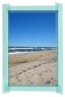
It was mainly just review work...you know, to check up on that we have remembered what we have learnt, for Jessica's class over the weekend. I have just done today's lesson about type and used this photo as my subject:
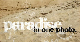
First we added a grungy paper texture to our photos. This gave a really nice but subtle effect on the photo that I had picked and I really like it :) The effect is most obvious on the sky part of the photo. Looks a bit like a worn and folded old postcard or something... Then we were adding type to the photo and Jessica included a link to a nice font for us to download. This is where the class ended.
I then decided to add in an extra (faded) brush effect behind my title work just to add that little bit extra. I'm really pleased with how it turned out...
So simple to do, yet it's just finding that little extra time to sit down and play like this...which I guess doesn't happen very often.
 First we added a grungy paper texture to our photos. This gave a really nice but subtle effect on the photo that I had picked and I really like it :) The effect is most obvious on the sky part of the photo. Looks a bit like a worn and folded old postcard or something... Then we were adding type to the photo and Jessica included a link to a nice font for us to download. This is where the class ended.
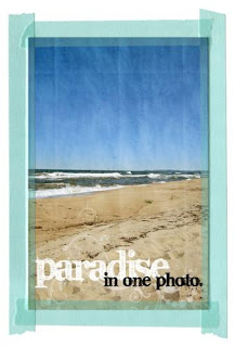
 I then decided to add in an extra (faded) brush effect behind my title work just to add that little bit extra. I'm really pleased with how it turned out...
 So simple to do, yet it's just finding that little extra time to sit down and play like this...which I guess doesn't happen very often.
Looks great! Can I ask what graphics package you are using? ty x
ReplyDelete