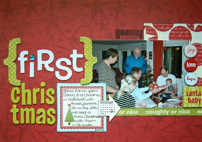
So I scrapped yesterday evening. No big deal you think, right? Well, I scrapped yesterday EVENING! I *never* scrap in the evenings!! LOL! I normally have my best scrapping ideas in the evenings and it's normally the time I feel most like scrapping, but I don't. I prioritise as I prefer to spend my evenings with Ross. Yesterday he had a few things that he needed to get done, so I did some scrapping and came up with this:
 I guess we're all very quick at criticising our own work, and I guess in a way you shouldn't point out things to people, but in this case I really must say that I do NOT like the "First" part of my title. Unfortunately the stickers made glue marks on my background so I had to keep it like this. Oh well. Supplies are: Scenic Route "Roxbury" papers, die-cuts and chipboard, American Crafts Thickers alphabets, Autumn Leaves stamp and Doodlebug jewel.
Well, I am not agree with you because I find the first part of title great. The only thing that I will have changed the blue glittered embelishment on the 'i'. As there is not other things blue on the page, but only for this reason. For the rest, I find it very beautiful and I love these colors! So don't care about it, but I have to say that sometimes I do not like things in my pages... such as most people who scrap I think.
ReplyDeleteI'll agree with you... I think it's because the "f" looks small compared to the other letters. I don't think it looks bad though, just a bit off balance. BUT had you not mentioned it, I wouldn't have noticed.
ReplyDeleteThe previous comment says there is no other blue on the page... what about the blue shirt that Anso's Dad is wearing? (at least I think that's Anso's Dad and I think the shirt is blue unless my monitor is showing something different!) That matches the sparkly blue on the "i" pretty well!
Ross looks so natural with babies! Very sweet moment :)
ups, sorry after looking better, I see where there is blue now... So there is nothing looking strange or bad in this page finally !!! A beautiful page with nothing to change !
ReplyDeleteI like the word First and would not have noticed had you not said anything.
ReplyDeleteLoving the gorgous baby layouts Anso.